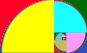
The golden ratio has long fascinated mankind because blah blah blah... And the golden rectangle has aesthetic properties because of yadda yadda yadda... If you don't already know about this magical number, I'm not the person to educate you. Trust me, it's cool.
About a year ago I decided to create the golden rectangle in pure CSS as a way to learn about inheritance and to prepare myself to create more complex fractals in CSS/HTML.
The golden rectangle has sides with a ratio of 1.618... which is special because, if you divide the rectangle into a square and another rectangle, the sides of the inner rectangle has the same ratio as the outer rectangle. It is made by repeating the same rectangle scaled down, rotated, and embedded into itself over and over. So we start with embedded divs, the first of which has a set size and the remaining are 62% (1/1.618x100%) the size to its parent div.
Then the child divs are placed at the top right corner, outside of the parent div using absolute positioning. The children are then rotated a quarter turn to create the golden rectangle.
If you hover over the rectangle above, the :hover pseudo class will rotate the child and all of it's ancestor divs. This forms the golden rectangle.
Next, :before (circle) and :after (background) elements are added to create colors. This creates the golden spiral. In the final product, all squares inside the golden rectangle are set to the same colors (red, blue, and yellow), which is then hue rotated to product a unique set of colors at each level. The hue rotation adds up as you go down the DOM tree, creating a wide array of colors with only 3 color declarations.
In this example, if you hover over a div it will remove hue-rotate for all child divs.
That's all for now. Tune in next time for an animated CSS tree fractal.